

Daniel Kaufmann grew up in Solothurn and studied in Bern. He worked at the Swiss National Bank (SNB) in a macroeconomic forecasting group. He was then hired by the KOF Swiss Economic Institute, where he conducts research on price and wage fluctuations in the Swiss economy.
Currently an assistant professor at the University of Neuchâtel, he focuses his research primarily on monetary policy. He has recently published articles on economic history, particularly on the relationship between deflation and economic activity.
It also develops forward-looking indicators, such as the “fever curve” for the Swiss economy.
The Fever Curve at a Glance
Since macroeconomic data is released with a considerable delay, it has been difficult to assess the health of the economy since the start of the rapidly evolving COVID-19 crisis. The “fever curve” for the Swiss economy was developed using daily financial market data and publicly available news reports. The indicator can be calculated with only a one-day lag. Furthermore, it is strongly correlated with macroeconomic data and survey indicators of Swiss economic activity. It therefore provides reliable and timely warning signals if the health of the economy deteriorates.
The unemployment and GDP forecasts for 2020–2021 keep changing. How do you explain this change?
These rapid changes in the forecasts can be attributed to two different factors:
- The closer we get to the forecast date, the more data is available, and therefore the more we can refine the forecast. It's a bit like the weather forecast.
- Officially released forecasts influence the behavior of consumers and investors, as well as the government. Initially, it was announced that the COVID-19 crisis would have a more severe impact on the economy than the Great Depression of the 1930s. As a result, the government implemented economic relief packages to mitigate the impact of the lockdown on the Swiss economy. These measures are proving effective and cushioning the blow, and the crisis is ultimately less severe than expected.
These forecasts therefore enable decision-makers to act proactively rather than reactively.
Regarding the fever curve, how did you come up with the idea of using daily data rather than quarterly data, for example?
The COVID-19 crisis served as a catalyst. In fact, the Federal Council had to make weekly decisions to manage the health crisis, whereas such decisions are typically made on a quarterly basis at a minimum. Consequently, the FOPH also published daily statistics.
In macroeconomics, the use of high-frequency data series is still rare. However, large amounts of data are available on a daily basis, such as credit card transactions from all Swiss households. It is important to note that high-frequency data has the drawback of producing false signals—temporary fluctuations that often need to be ignored. Generally, we monitor these data over several weeks to ensure that meaningful information is emerging. In contrast, our indicator combines several sub-indicators from different databases to reduce the likelihood of a false signal.
Given how quickly information spreads, do you think the frequency of decision-making is increasing?
That is indeed possible. For example, the SNB announced the introduction of the exchange rate floor outside of the institution’s official quarterly reporting dates, which came as a surprise. In the case of COVID-19, the government had to adapt very quickly. And in this context, indicators such as the fever curve become particularly useful.
Who has access to the fever curve?
For now, the data and code are available as open source on GitHub, a development platform. The goal of this project is to use only data that is freely available. This way, anyone can improve the data or use part of it by combining it with other data. You can go to GitHub, download the indicator, and use it in a forecasting model or simply examine the relationship between GDP growth and the unemployment rate. The advantage of this indicator is that it can be calculated daily, which is quite rare in the world of economic forecasting.
We have received numerous comments from our users. The indicator has been mentioned in various reports, such as those from Credit Suisse and SwissLife.
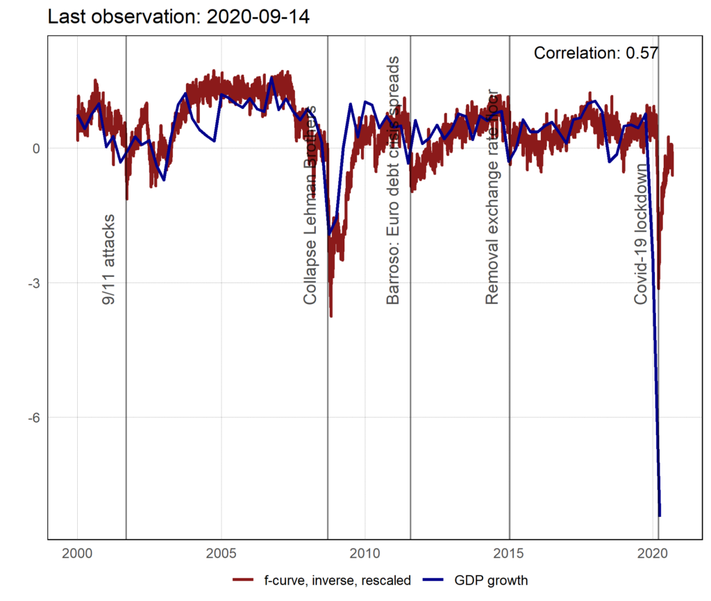
When the curves are above zero, GDP increases; when they are below zero, GDP decreases (note that the fever curve is inverted to facilitate comparison with GDP). During the Lehman Brothers crisis in 2018, there was a sharp drop in GDP—that is, a recession—and the fever curve index followed this trend, although the correlation was not perfect (0.57). The purpose of the fever curve is not necessarily to link it to a statistical concept but rather to forecast economic trends based on higher-frequency data. During the COVID-19 crisis, the curve signaled a sharp drop in GDP as early as March, even though the decline in GDP during the first quarter (published by SECO in June) was even more significant due to the lockdown. Only about ten variables are used to calculate the fever curve, which also explains why it can sometimes send imprecise signals. But generally speaking, the fever curve follows the same trends as the rise or fall in GDP growth.
How does the “sentiment score” work, which is used to visualize the fever curve?
The sentiment score is based on Swiss newspaper articles—currently in German—but we’re in the process of expanding our selection to include French articles. We take thelead text into account because that’s where important information is often conveyed. Furthermore, it’s often available for free, which makes the fever curve accessible to everyone. We are currently analyzing whether it would be relevant to consider more than just the lead text.
Specifically, we count the number of words with positive and negative connotations (based on existing lexicons). We then subtract the negative words from the positive words and divide the result by the total number of words used.
This approach is used in marketing to assess a brand's reputation. Is this a new concept in economics?
In economics, this approach is also similar to business sentiment surveys—such as those conducted by the KOF—in which companies are asked to assess their situation in a qualitative questionnaire. Professor David Ardia has worked on sentiment-based indicators, though primarily for the United States. Other researchers have examined indicators based on recent search engine user queries. The drawback of this latter approach is that this data has only been available since 2006. However, for our indicator, we needed to test our variables against several recessions. So, we calculated the fever curve starting in 2000, and we are currently evaluating whether we can extend the indicator even further.
Currently, our sentiment score is still too volatile because it is based on a limited amount of data, but we are working to expand that dataset. That is why we combine these sentiment metrics with financial market data in the fever curve.
Depending on your model, is the Swiss economy influenced by foreign or domestic factors?
To answer this question, we categorized the articles by country of origin. Specifically, we searched for words such as “Switzerland,” “Europe,” and “Germany” in the articles before calculating sentiment.
Our indicator uses not only sentiment but also financial market variables (for example, risk premiums or stock price volatility). For financial market variables, we use data on the interest rate in Swiss francs for Swiss corporate bonds. In addition, we sought out the same variables abroad. With this categorization, our statistical approach allows us to attribute the indicator’s fluctuations to both foreign and domestic variables.
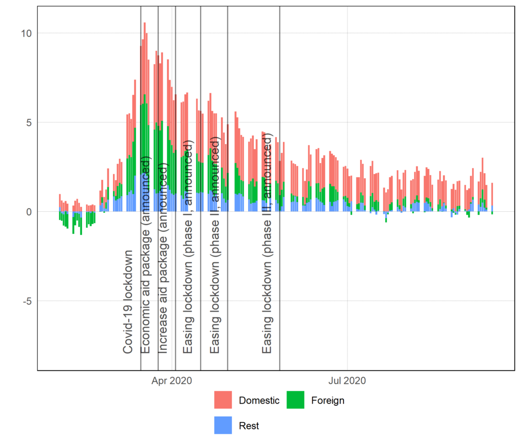
The graph shows that the contributions of foreign and domestic variables were roughly equal at the peak of the crisis (note that the fever curve is not inverted; an increase indicates a rise in “fever,” i.e., a deterioration in the economic situation). Recently, the domestic contribution has been greater. Indeed, this crisis has affected both demand for Swiss products and domestic demand, as the climate of uncertainty (particularly regarding employment) has prompted the Swiss to save more.
The impact of a total lockdown on economic growth is often questioned. There have been attempts to cross-analyze pandemic and economic models. The findings suggest that even without a lockdown, the population would have protected itself by limiting social activities outside the home. At the very least, a national government directive has the merit of establishing a uniform protection policy, while reassuring people that they can count on a government capable of making decisions in an emergency.
You're still working on this model—are there one or two specific areas you'd like to improve for future versions?
My Ph.D. student, Marc Burri, who is a co-author on this article, is working on improving the model for his dissertation. We are collecting more data from additional French-language newspapers and newspapers from Ticino to see if the information we receive differs.
In a second phase, we would like to move away from the “sentiment score,” which is a somewhat naive approach.
By using machine learning, we could consider more segmented fever curves —by industry or region, for example—rather than focusing solely on the Swiss economy as a whole.